
Such a Mensch
June 22, 2010 at 11:15 AM by Dr. Drang
It seems that Robey Pointer, one of the Twitter guys, has made some changes to Apple’s monospaced Menlo font. He calls the new(ish) font Mensch and has released it for all to use.1 Let’s take a look.
Menlo, as you may recall, is Apple’s redesign of Bitstream’s freely available Vera Sans Mono font. Here’s an alphabet of Menlo at 48 points. If you roll your mouse over the image, it’ll switch to Mensch. Roll back out and it returns to Menlo.2
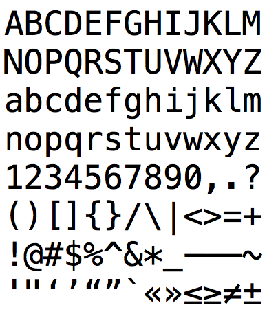
The differences are:
- He’s replaced the slash in the zero with a dot, taking it back to the Bitstream form.
- He’s made the less-than and greater-than signs much broader.
- He’s gotten rid of the curly tail on the lower case l.
- He’s removed the baseline from the numeral 1 to make it more distinct from his new l.
- He’s put a curl in the lowercase q.
- He’s run the tail of the uppercase Q into the oval and made it thicker.
- He’s put a corner in the upper loop of the numeral 3.
- He’s rounded of the dots in the lowercase i and j and in the question mark and exclamation point.
- He’s closed off the upper loop of the ampersand.
I love the restoration of the dot in the zero. I’ve always thought to switch to a slash was a mistake, a surprising move to a more pedestrian look from the usually stylish Apple.
I’m not sure about the broader < and >. On the whole, it’s probably a good thing, because most people use those symbols as angle brackets and having them sized more like the other bracketing symbols will work well. But for those of us who still do math programming, having these symbols so much broader than the equals sign is going to be weird.3
The other changes, I must say, leave me cold. After such a promising start with the zero, the changes to the l, and the Q seem to be a step backward to the dull and ordinary. And although his q is quite good looking, I really prefer q to be a mirror image of p.
As for the 3, Robey says
Three is rendered in the gothic style, because the gothic style is clearly superior.
I like his bold declaration of preference even though I despise the preference itself.
Finally, rounding off the dots is another unfortunate shift to the prosaic. And an inconsistent shift, too, as he made no changes to the squared-off period and comma.
For completeness, here’s Vera Sans Mono with a Menlo rollover effect.
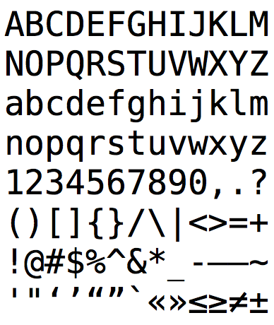
And finally, Vera Sans Mono with a Mensch rollover effect.
Although I’m sure many people will prefer Menlo or Mensch, I’m sticking with Vera Sans Mono.4
-
Notice that Robey is taking advantage of webfonts and using Legitima as the body font in his blog. Nice. ↩
-
I stole this idea from Jon Shea’s Menlo/Vera Sans Mono comparison. ↩
-
When I was first learning to program (I’m still learning to program), math was far and away the most common use of computers. How things have changed. ↩
-
Or DejaVu Sans Mono, which is Vera with more Unicode glyphs. ↩