Easter in Mathematica
April 5, 2026 at 7:42 PM by Dr. Drang
Yesterday’s post included some behind-the-scenes calculations that I figured were worth talking about. They were all done in Mathematica, and here’s the notebook I used:
The first calculation works out the days of the vernal equinox in every year from 1961 through 2026. The key function for this is FindAstroEvent, a fairly new function that returns the date and time of the first occurrence of a given event after the given date. I asked for the first MarchEquinox after January 1 of each year, and I wanted the time to be given in Greenwich Mean Time. Since I only cared about the day of the month, I used the DateList function to convert the DateObject returned by FindAstroEvent into a list of year, month, day, hour, minute, and second and pulled out just the third item of that list.
With equinoxes set to a list of 19s, 20s, and 21s, I used the Tally function to count the occurrences of each day number. As you can see, there were 58 20s in the list of 66 equinoxes, so I included that result in the post to show that March 20 is the most common date of the vernal equinox.
The remaining calculations were done to compare the algorithmic date of Easter with the date that Easter would be if it were determined by the actual date of the first full moon after the vernal equinox. So I used FindAstroEvent again, this time setting the event to FullMoon and the date to the equinox dates calculated earlier. That list of DateObjects was saved to the variable fullMoons.
I needed to compare these dates to the dates of Easter for the years of interest. Oddly, Mathematica doesn’t seem to have a built-in function for calculating Easter, but it does have a ResourceFunction. The function is called EasterSunday, and it calculates the date for the given year.
With the lists of easters and fullMoons in hand, I subtracted the latter from the former. If the difference is more than a week, the algorithmic and astronomical Easters aren’t in agreement. As you can see, there are two instances in which Easter is 31 days after the full moon: first in 1962 (which I didn’t mention in the post) and then again in 2019 (which I did). The final calculation was just a repeat of one of the calculations in equinoxes; I did it again so I wouldn’t have to hunt down the 2019 equinox date.
I’m not sure when I learned of the FindAstroEvent function, but it really came in handy yesterday. I’m pretty sure there are functions in Calendrical Calculations that deal with equinoxes and full moons, but I haven’t gotten that far in the book yet.
Scientific American’s Easter
April 4, 2026 at 11:12 PM by Dr. Drang
In its continuing attempt to teach us how calendars work, Scientific American has an article (Apple News link) up today that goes through Gauss’s algorithm for calculating the date of Easter. The article was written by Manon Bischoff, who also wrote the Friday the 13th article I covered a few weeks ago.
There are a few small mistakes in the article: one computational and two definitional. Let’s take a look at them.
The computational error comes in the calculation of the intermediate value p. The article says
where the topless brackets mean the floor function, the integer less than or equal to what’s inside the brackets. The correct equation is
In both equations, k is
i.e., the first two digits of the year (at least until we get to the year 10,000).
In giving the wrong equation for p, Bischoff is following Gauss himself. In the original presentation of his Easter algorithm, Gauss gave the same simple formula as Bischoff, but he corrected it several years later. Why Bischoff is still using the wrong equation two centuries later is anyone’s guess.
Actually, I can guess. Maybe Bischoff’s using the wrong formula for p because it’s simpler and the error won’t manifest itself until the year 4200 (!). Here’s a quick Python script to see the centuries, starting in the 1600s, for which the simpler formula is wrong:
python:
for k in range(16, 60):
  if k//3 != (13 + 8*k)//25:
    print(f'Century {k*100} gives the wrong value')
The output is
Century 4200 gives the wrong value
Century 4500 gives the wrong value
Century 4800 gives the wrong value
Century 5100 gives the wrong value
Century 5400 gives the wrong value
Century 5700 gives the wrong value
I think we can live with a mistake that won’t rear its head for over 2000 years.
I’m less inclined to overlook the definitional errors in the article’s early paragraphs. This one:
For those who celebrate it, tracking what day the holiday Easter takes place on can be a challenge. According to Christian religious traditions, Easter Sunday falls on the first Sunday following the first full moon after the vernal equinox.
And this one:
[T]he vernal equinox, or start of spring, is fixed as March 21. If a full moon occurs on that exact day, March 22 becomes the earliest possible calendar date for Easter Sunday. According to the lunar calendar, the latest possible date for a full moon after March 21 is April 18. That means Easter Sunday never falls later than April 25.
While it’s true that the idea behind the date of Easter is to be “on the first Sunday following the first full moon after the vernal equinox,” when it comes to determining Easter, both the equinox and the lunar cycle are estimated—they aren’t based on accurate astronomical calculations or observations.
First, let’s look at the vernal equinox.1 One need only think back a couple of weeks to realize that it isn’t “fixed as March 21.” The most recent equinox was on March 20, as were 58 of the 66 vernal equinoxes I’ve lived through. March 20 is by far the most common date for the true vernal equinox. The Church fathers who set the date of Easter used March 21 as an approximation because it made the calculation simple and resulted in Easters more or less when they thought they should be.
Similarly, they used the Metonic cycle—with some occasional adjustments—to estimate when full moons would occur. There are almost exactly 235 lunar months in 19 years, a fact you can use to calculate a good estimate of when full moons occur.2 But this is an average, and because lunar months vary in length, the date of a calculated full moon doesn’t always fall on the date of an actual full moon. (There’s also a slow drift that has to be accounted for.)
So although the date of Easter is guided by astronomical events, it isn’t determined by them. As it happens, this year the vernal equinox was, as we said, on Friday, March 20, and the following full moon was on Wednesday, April 1. So having Easter Sunday on April 5 works out both astronomically and algorithmically. But in 2019, that wasn’t the case. The vernal equinox was on Wednesday, March 20; the following full moon was on Thursday, March 21; but Easter Sunday was celebrated on April 21, not March 24.
A less complicated complication
March 29, 2026 at 10:42 AM by Dr. Drang
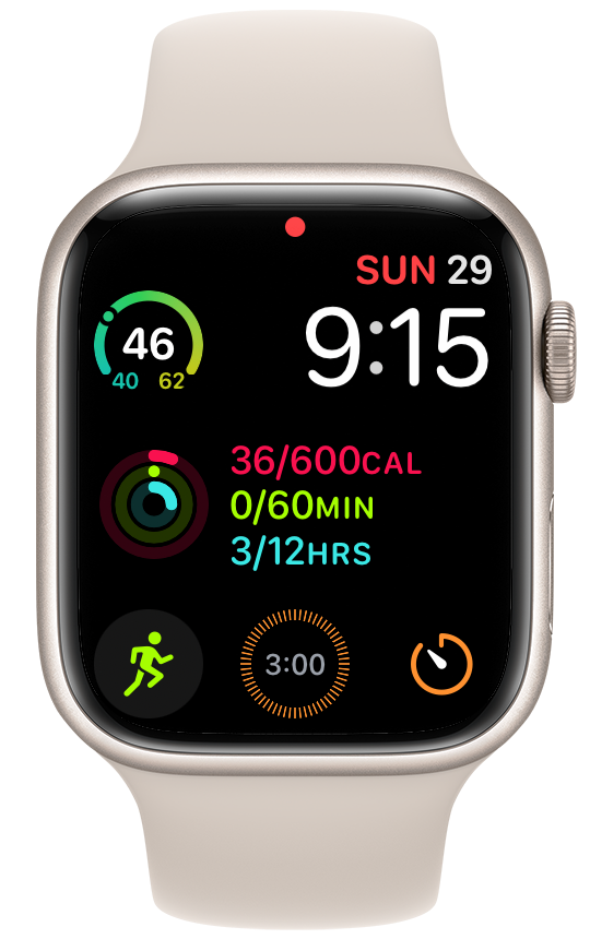
Back in January, I complained about the Apple Watch’s Timer complication being too complicated. A couple of days ago, Dan Moren told me on Mastodon that my complaint had been addressed in watchOS 26.4, which was released earlier this week. After a surprisingly quick update of my watch (I had already updated every other device to 26.4 but somehow forgot to do the watch), I added a 3-minute timer as the bottom center complication and, miracle of miracles, it worked exactly as it should.

To recap, my January complaint was that although I could create a complication that looked like it would start a 30-second timer when tapped, that complication actually required a second tap on a smaller button to start it—a stupid way to implement the feature. As of 26.4, the stupidity has been removed. Now the timer starts immediately when you tap the complication.
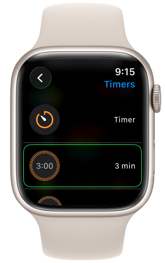
If you’d like a quick way to set a specific timer on your watch, press and hold on your watch’s home screen, tap the Edit button, and then swipe (if necessary) to get to the complications screen. Tap the complication you want to change to a Timer, scroll through the list, and choose Timers. At this point, you will be given the option to choose either a generic timer complication—one that just opens the Timers app—or one set to one of the specific times you’ve created in the Timers app.

Choose the one you want and go back to your home screen. Now you have a specific timer complication that works the way it should.
(Aside: I wanted a 30-second timer in January because I was doing physical therapy stretching exercises then that were supposed to be held for 30 seconds. I’m not doing those exercises anymore, so I made a 3-minute timer for tea.)
Thanks to Dan for telling me about this. I had given up on this type of complication and wouldn’t have thought to look for the improvement.
Another improvement in 26.4—one that’s sort of mentioned in the release notes—is that you no longer have to tap the small arrow button to start a workout. You can also tap anywhere in the big area around the exercise icon above the three bottom buttons on the Workouts screen. And you don’t have to wait for the arrow button to slowly animate into view.

I bitched about the previous behavior—prompted by a Greg Pierce complaint—in December. It’s almost as if Apple is listening now.
Are you a mod or a rocker?
March 27, 2026 at 6:07 PM by Dr. Drang
I’ve been working my way slowly through Reingold and Dershowitz’s Calendrical Calculations. This week I hit Chapter 11 on the Mayan and Aztec calendars and came across a notation for modulo arithmetic that wasn’t familiar to me.1 I figured I’d write about it here on the off-chance that any of you would find it interesting. Also, to make it stick in my head a little better.
The notation came up in the section on the Haab calendar, a sort of solar calendar that the Mayans used along with the Tzolk’in and Long Count calendars. The Haab calendar has 18 months of 20 days each and then a 19th sort-of-month with just 5 days. There’s no year number in the Haab calendar, so there’s no way to convert directly from the Haab calendar to other calendars. But there is a way to get a date in another calendar that’s on or nearest before a given Haab date.
Reingold and Dershowitz use a “fixed” or “RD” calendar as their way station between all the calendars. It’s a single day number that counts up from what would have been January 1 of the Year 1 in the Gregorian calendar if the Gregorian calendar had existed back then. In this system, 0001-01-01 is Day 1 and today, 2026-03-27, is Day 739,702.
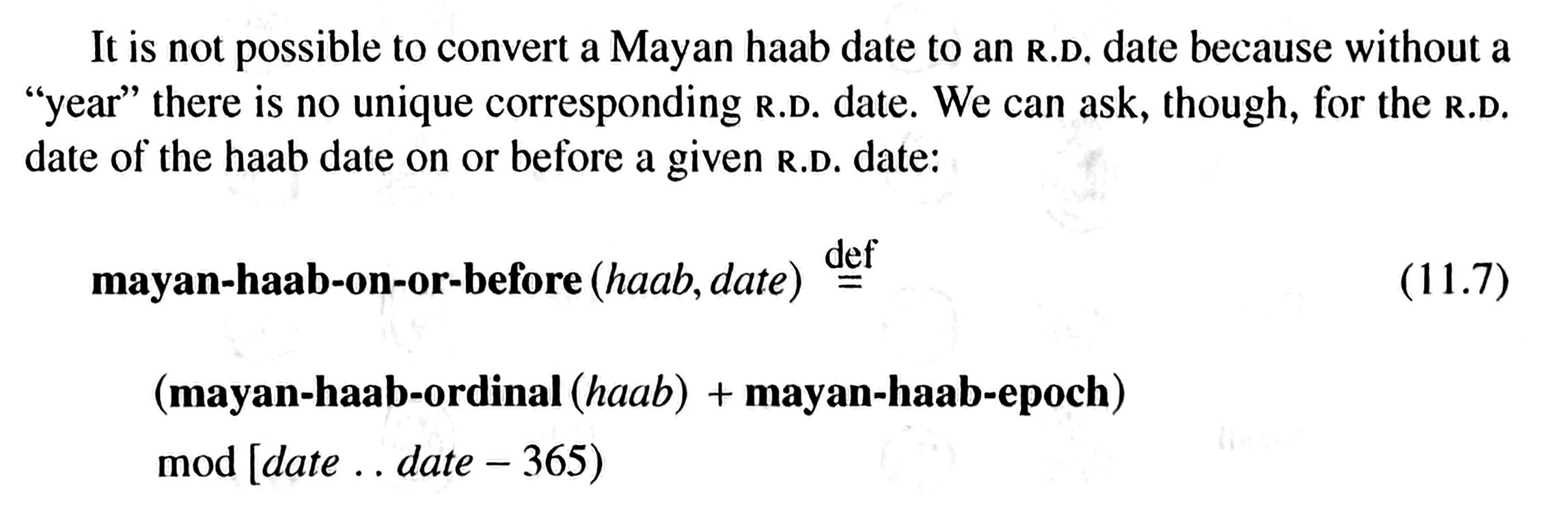
The function that finds the closest given Haab date on or before a given fixed date is called mayan-haab-on-or-before, and it’s defined this way in the text:

What’s odd about the modulo notation in this definition is that the thing after “mod” isn’t a divisor, it’s an interval: the half-open interval between date (inclusive) and date – 365 (exclusive).
Here’s how R&D define this interval modulus, both in Chapter 1 of Calendrical Calculations and in this ACM paper:
As long as the two ends of the interval aren’t identical, the answer will lie in the range . This notation is helpful in shifted modulo operations like the one in mayan-haab-on-or-before because it explicitly tells you the range of answers you’ll get. The idea is that the resulting fixed date will be anywhere from 0 (inclusive) to 365 (exclusive) days before the given date.
(The normal modulo notation, , could be written as , although this doesn’t seem particularly helpful.)
Note that in mayan-haab-on-or-before, the interval goes backward, which means the divisor in the standard mod function is a negative number: –365. If you’re implementing this function in a programming language, you have to make sure that using a negative divisor in your language’s mod will give you a negative answer. This means that mod must have a floored definition. The mod function in Lisp, which R&D are using, and the % operator in Python, which I’m using as I reimplement R&D, both use the floored definition.
I mentioned earlier that the 19th month of the Haab calendar is an oddball because it has only 5 days. As it happens, today is smack in the middle of that 19th month, which is called Wayeb or Uayeb, depending on whose transliteration you use.
Another odd thing about the Haab calendar—something that computer programmers must love—is that the day numbers within a month start at 0, not 1. So Monday, which is the start of the next Haab cycle, will be 0 Pop, Pop being the name of the first Haab month.
-
It would have been familiar if I’d read Chapter 1 carefully instead of skimming, but I was eager to get past the preliminaries quickly and figured I could always go back to Chapter 1 if necessary. Which it was. ↩
