Presentations and expectations
July 26, 2014 at 11:05 PM by Dr. Drang
You’ve probably heard by now about the latest bestseller from the MacSparky publishing empire: Presentations. In it, David Sparks does his usual thorough job of walking you through the nuts and bolts of building a presentation in Keynote. But Presentations is more than just a software manual. David also hands out good advice on hardware (including preparing for hardware disasters) and putting together a good performance.
David also fights the good fight for better presentations independent of software and hardware. The first two chapters in particular talk about what makes a compelling presentation, but there are nuggets of wisdom regarding pacing, focus, and effective storytelling sprinkled throughout. This is the stuff that’s most likely to be ignored—often because presentations are expected to be bad.
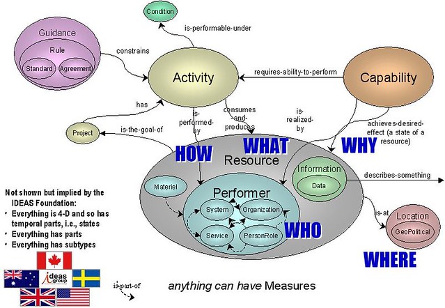
You may remember this article by Paul Ford from a couple of months ago that made fun of presentation slides used by the military. Theses slides violate all the conventional wisdom by being overpacked with words and graphics.
from Medium
Eric Hess had a very nice followup post a few days later. He didn’t defend the look of these presentations, but he did explain their genesis:
Tragically, the military shares a misconception with the rest of the government and much of the business world that the slides should be able to act as a substitute for the speaker. While you’d think this would drive presentation designers towards clarity, it often does exactly the opposite. Diagrams with bulleted annotations can rarely provide the clarity and fidelity of well-written prose supported by a few well-chosen graphics. Yet busy executives don’t want to take the time to read a multipage essay.
I don’t have any experience with the military, but what Eric says matches perfectly with what I’ve seen from manufacturers. When I start a new consulting project, I usually get sent a bunch of paperwork (sometimes on paper, more commonly on disc) with information on the product at issue. Inevitably, as I flip through the stack of drawings, photos, and test data, I’ll run into a series of pages that have to be turned from portrait to landscape: a PowerPoint deck describing some aspect of the product’s development. It’s not a report written with paragraphs that build on each other; it’s a set of graphs and disconnected sentence fragments arranged as bullet points.
It’s never clear to me whether there actually was a live presentation associated with the deck. But it is clear that the deck was expected to stand on its own—a substitute for the speaker, in Eric’s words—and that it was circulated among the relevant engineers and managers in the company and expected to be read as if it had all the information and clarity of a report.1
This is why all the well-intended advice on making good presentations doesn’t get followed. There is an expectation in many places that the slide deck will not simply be an adjunct to a presentation; it will be the only permanent record of the ideas and information contained in that presentation, and it is judged as such by the presenter’s superiors. When a slide deck takes on that burden, both it and the presentation lose the fluidity that David’s book tries to steer you toward.
The answer, of course, is to have both a written report and a presentation. This is the norm in the academic world, where the published paper is one thing and the talk based on it is another. But this is considered inefficient in most businesses, so the poor slide deck has to pull double duty. And ends up being bad at both jobs.
-
Reports can be poorly written, of course, but they tend to be more disciplined and more coherent than slide decks. The need to write sentences that form paragraphs and paragraphs that form sections imposes a structure on the writer’s thinking. I can’t remember where I heard or saw this, but Andy Ihnatko once said something like “I don’t write to say what I think; I write to figure out what I think.” A bunch of bullet points won’t do that. ↩

