Documentation
July 29, 2014 at 10:54 PM by Dr. Drang
Since Marco Arment tweeted a link to my post on Overcast, I’ve gotten about twice as much traffic as usual and an undeserved reputation as an expert on Overcast’s features. Because of the latter, I’ve been fielding questions about Overcast that should be going to Marco himself, the wily bastard.
Much as I enjoy acting as Marco’s unpaid support tech, I really wish overcast.fm had a couple of pages of explanation for its settings and use. Overcast is easy to use, but not every feature is obvious.
Overcast is hardly the only app that could use a little documentation. There seems to be belief among software developers nowadays that providing instructions indicates a failure of design. It isn’t. Providing instructions is a recognition that your users have different backgrounds and different ways of thinking. A feature that’s immediately obvious to User A may be puzzling to User B, and not because User B is an idiot.
You may not believe this, but when the Macintosh first came out everything about the user interface had to be explained. How to click a button, how to select an item from a menu, how to drag an item from one place to another. Oh, it was way easier to use a Mac than any other computer, but the conventions we now take for granted weren’t conventions yet because no one had experience with mice, menus, windows, and icons. All of these features seem intuitive to today’s users because they learned them as children and don’t remember not knowing them.
Jef Raskin wrote about this long ago in a paper with the wonderfully summarizing title “Intuitive Equals Familiar.” Here’s Raskin saying it better than I have:
As an interface designer I am often asked to design a “better” interface to some product. Usually one can be designed such that, in terms of learning time, eventual speed of operation (productivity), decreased error rates, and ease of implementation it is superior to competing or the client’s own products. Even where my proposals are seen as significant improvements, they are often rejected nonetheless on the grounds that they are not intuitive. It is a classic “catch 22.” The client wants something that is significantly superior to the competition. But if superior, it cannot be the same, so it must be different (typically the greater the improvement, the greater the difference). Therefore it cannot be intuitive, that is, familiar. [emphasis mine]
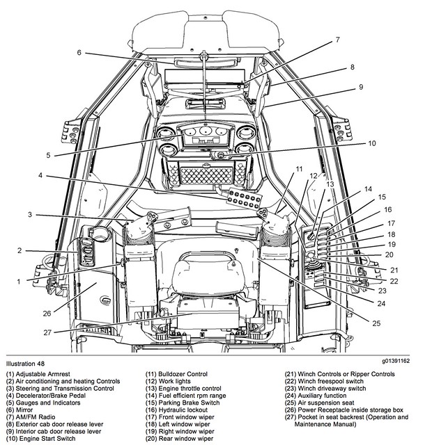
Let’s think about it another way. Here’s the layout of cab controls in a Caterpillar D5 dozer. Every D5 comes with an operator’s manual, and no one would expect otherwise, even though Caterpillar’s designers do their best to make the controls discoverable, comfortable, and easy to use; even though equipment operators are expected to be trained; and even though there are conventions for control design among construction equipment manufacturers.
A typical Mac app has more controls—buttons, sliders, menu items, whatever—than the cab of a D5. Anyone can buy an app and start using it with no training whatsoever. And yet somehow it shouldn’t have an operator’s manual?
The desire to make computer programs as easy to use as possible is admirable, and the success developers have had in doing so benefits us all. But a little instruction here and there wouldn’t hurt.
-
John Siracusa’s comments about Overcast’s settings on the latest ATP episode match up with my experience. ↩

