Pixel photomicrographs
March 16, 2012 at 8:59 PM by Dr. Drang
For a guy who doesn’t post often, Lukas Mathis has been on fire lately. A couple of days ago, there was his Mystery Meat UI criticism of the new iPhoto for iOS, and today he popped out a wonderful post with over a dozen photomicrographs of phone and tablet screens.
I’m ambivalent about the iPhoto criticism. On the one hand, many of its features are hidden, and it’s hard to imaging a novice user being able to figure them out on his own. On the other hand, high end tools in the real world often take time to learn and master—I don’t think it’s unreasonable to expect the same from digital tools. The question is: who is iPhoto for?
Certainly iPhoto for the Mac has always been positioned as a beginner’s program. Even as it’s gained features, simplicity has been its watchword. The high end is covered by Aperture.
Since there is no Aperture for iOS, and there is the elementary and free Camera app, iPhoto could be thought of as the pro-level photo tool for iOS. If that’s the case, the mystery meat gestures make more sense. But it would be weird for Apple to use the same name for two programs pitched at different levels.
I found the photos in his Under the Microscope post fascinating. So many different designs and shapes for the individual red, green, and blue elements! If you haven’t seen it yet, go now; I’ll be here when you get back.
(♫ Tall and tan and young and lovely, the girl from Ipanema goes—oh, you’re back. Good.)
One thing that did frustrate me about Lukas’s post was how small the photos were. Only 350×250 pixels, with no links to higher resolution versions. Also, I noticed he didn’t have a photo of a pre-Retina iPhone
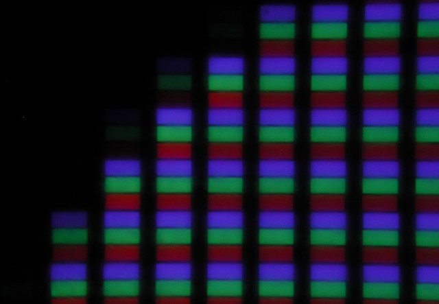
Here’s my old, original iPhone:
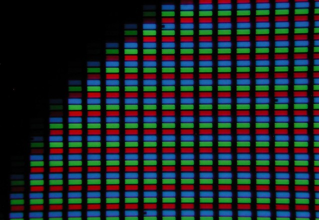
And here’s my iPhone 4:
Both photos were taken at the corner of the icon for the Photos app. The magnifications are the same.
I’m not thrilled with the photo of the older phone. Try as I might, I just couldn’t get a sharp image of it. But the iPhone 4 photo is pretty good. In the full-sized image (which you can get to by clicking on the photo to go to its Flickr page) you can see that each colored element is made of three smaller elements. That’s something that doesn’t come out in Lukas’s photo of the 4S.
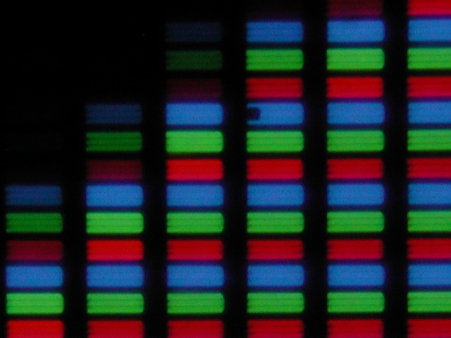
Here’s a zoomed-in view of the top center of the iPhone 4 photo:
See that notch in the blue element? That’s real, not an artifact of photography. Those notches are in several of the blue elements across the screen. You can see three of them in the first photo of the 4.
As for scale, in the full-resolution photo of the original iPhone, the iPhone’s pixels are 230×230 photo pixels. In the full-resolution photo of the iPhone 4, the iPhone’s pixels are 115×115. The ratio is just as you’d expect.
If you get a chance to look at your phone or tablet through a microscope, take it. You’ll get a more interesting view than any of these photos show.
-
By the time you read this, he may have. He’s been updating the post with new photos all day. ↩
-
The icons are not the same. The original iPhone is running iOS 3.1.3. The iPhone 4 is running iOS 5.1. With the brightness turned up all the way on both devices (which is how I took the photos), the background of the older Photo icon was a deeper blue. ↩


