
Trunk Notes
November 22, 2010 at 10:23 PM by Dr. Drang
I mentioned Trunk Notes, the iOS wiki system that uses Markdown formatting, in my post last month about the state of Markdown. I’d been alerted to it by reader Danstan’s comment1 on my MarkdownMail post and had visited its web site, but I hadn’t bought or used it. No TextExpander, no Dropbox, no thank you.
But Trunk Notes did seem promising, so I started following its developer, Matthew Kennard, on Twitter, and earlier this month he tweeted this:
Last reminder :o) Get Trunk Notes for just $0.99! On Monday the price goes up, and 2.4.0 is released (Dropbox sync and TextExpander)
@appsonthemove Matthew Kennard
Ninety-nine cents was irresistible, so I bought it before the price rise. A few days later the update came through, but I was busy and didn’t give it a look until today. It’s pretty impressive. I don’t know how stable it is in day-to-day use, but it’s certainly worth considering if you’re in the market for an iOS note-taker.
Actually, note-taker is something of a misnomer, for although Trunk Notes definitely works as a note-taker, its emphasis on formatting and presentation makes it more of a note-reader. In Trunk Notes, the default view of a note is the formatted view, with multiple fonts, styled text, and links to other notes. The plain text view, where you do your editing, is subservient.
Contrast this with Elements, where the plain text view is the default and the formatted view—also via Markdown—is secondary. Although I have several notes, like train schedules, saved in Elements that I never edit, Elements emphasizes note-taking instead of note-reading.
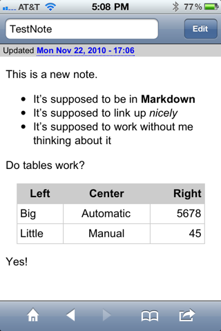
Further to this point, Trunk Notes has a much nicer default format for tables than Elements has. Here’s a sample note I made up for testing:
Compare that with the same note, formatted in Elements:
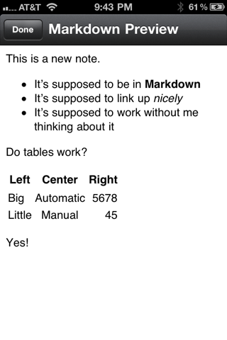
I freely admit that I like the table in Trunk Notes better than the one in Elements because it more closely resembles the default table formatting I’ve chosen for this site:
| Left | Center | Right |
|---|---|---|
| Big | Automatic | 5678 |
| Little | Manual | 45 |
But honestly, don’t you think the Trunk Notes table looks better, too?
Not that the Trunk Notes table style is perfect. The column separator lines should be darker so you could see them against the header background. But apparently (and I’m throwing in the weasel word because I haven’t tried this myself yet) Trunk Notes allows you to write your own CSS and override its default styles. A great feature, and one that once again emphasizes presentation.
Trunk Notes has two significant downsides, though, both of which prevent me from adopting it as my main notes app. First, although it syncs to Dropbox (and, like PlainText, allows you to choose which Dropbox subfolder to sync to), it doesn’t do so automatically. Worse, you have to go through a three-button tapping sequence to do the sync. That’s just too easy to forget, which could leave your edits unsynced, stranded on your iPhone.
Second, Trunk Notes puts several lines of metadata into a header at the top of your files, a header you probably don’t want when using those files on your computer. Here’s the full contents of the file shown above:
Title: TestNote
Timestamp: 2010-11-22 23:06:52 +0000
Last Accessed: 2010-11-22 23:08:15 +0000
Times Accessed: 8
Tags:
Metadata:

This is a new note.

* It's supposed to be in **Markdown**
* It's supposed to link up *nicely*
* It's supposed to work without me thinking about it

Do tables work?

Left | Center | Right
----|:----:|----:
Big |   Automatic |  5678
Little |  Manual   |   45

Yes!
I didn’t see all the header lines when I was editing the file on my iPhone, but I sure saw them when I opened it in TextMate. For data files, like my Weight.txt file, the header screws up any post-processing you might want to do.
So I’m sticking with Elements because it’s better for what I do most. But I can certainly see where others would find Trunk Notes very attractive.
-
Danstan tweets under the handle @xolaniboy and regularly links to interesting science articles. ↩