
Webfonts for the 18th century
May 20, 2010 at 9:28 PM by Dr. Drang
This morning, in a burst of pure genius, Dan Sandler (@dsandler) tweeted this:
Attention all 17th–18th century blogger-scholars: Your font needs have now been met. http://code.google.com/webfonts/list?family=IM+Fell
Sure enough, if you follow that link you’ll be taken to the preview page for IM Fell, an old-looking family of fonts, now available as webfonts through the auspices of the Google Font Directory.
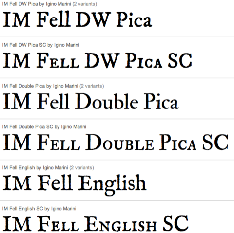
I’m not a 17th or 18th century blogger, but I do follow an 18th century Twitterer, @DrSamuelJohnson, whose Tweets do ring with the Sound of RASSELAS.

I thought it would be fun (and easy—if it weren’t easy I wouldn’t have bothered) to rejigger Dr. Twoot to display Dr. Johnson’s tweets in IM Fell English.
First, I linked to IM Fell English in the <head>:1
<link href='http://fonts.googleapis.com/css?family=IM+Fell+English' rel='stylesheet' type='text/css'>
Then I used the Twitter API to detect tweets by the user DrSamuelJohnson and wrapped those in <span class="c18th">...</span> tags. With this addition to the CSS style file,
span.c18th {
  font-family: 'IM Fell English', 'Lucida Grande';
  font-size: 18px;
}
I was done. The font size had to be kicked up a bit because IM Fell English is on the small side.
Here’s how it looks.

Ten minutes of work that makes me smile whenever Sam Johnson’s tweets appear. If you’re so inclined, you can dig into the details at Dr. Twoot’s GitHub repository.