
iPhone Notes fonts again
June 30, 2009 at 11:15 PM by Dr. Drang
In this post last week, I presented screenshots from my iPhone that showed the line-to-line spacing of certain fonts—Helvetica in particular—not matching the horizontal line spacing in the background image of the Notes app. Today, after reading this post by Beau Smith, I tried using Helvetica again, and this time it did line up. If I hadn’t taken those screenshots last week, I’d wonder if I had imagined everything.
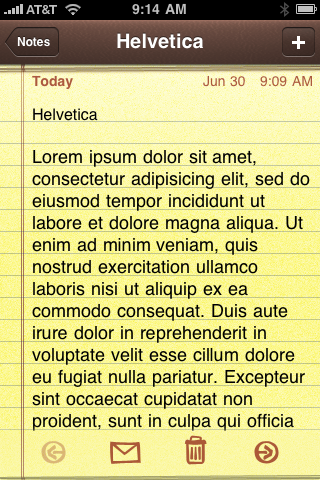
So here’s today’s screenshot of a Note that’s written in Helvetica 16. I created it in Mail and synced it to my iPhone.
Similarly, here’s a note I made today in Mail using Georgia 16 and synced to my iPhone:
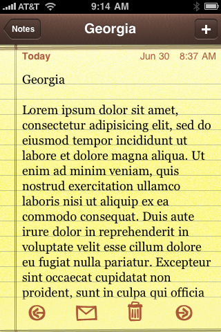
Obviously, in each case the line-spacing matches that of the background image—something that wasn’t true in the screenshots I took last week. Why the difference between then and now? Damned if I know, but I’m glad that Helvetica is now lining up for me, because that’s the font I really want to use in Notes.
For reasons explained in last week’s post, I’ve created in Mail a set of Blank notes1 that use Helvetica and synced them to my iPhone. To make a “new” note, I open one of the Blanks and edit it. The note stays in Helvetica, which is so much easier to read than Marker Felt.
There is, however, still some weirdness left in the Notes/Mail/font/sync system. I thought that changing the default Note font in Mail to Helvetica 16 would make it easier for me to make Blank notes.
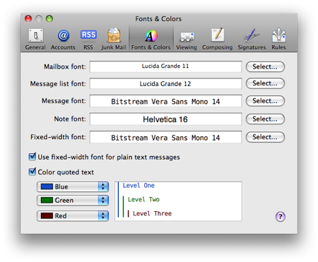
Not so. Blank notes created with this default in Mail showed up in Marker Felt when synced to the iPhone. I had to set the Note font in Mail to something else—I capitulated to Apple’s desires and reverted to Marker Felt—and then change the font in each Blank note to Helvetica before syncing to get those notes to show up in Helvetica on the iPhone. After last week’s oddness, I have no confidence that this requirement is universal or even that it will still be a requirement for me next week; I’m just reporting what I see.
-
The contents of each Blank note is just the word “Blank” on the top line. ↩