
Automated charts with Gnuplot
June 19, 2008 at 5:51 PM by Dr. Drang
Every month since the fall of 2006, I’ve written a post like this one, in which I include a chart of US and coalition fatalities. This is a reduced version of the latest:
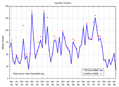
I get the data from icasualties.org and generate the chart using Gnuplot, the venerable Unix plotting program. I figured it was about time I showed how I do it.
Gnuplot began its life as a terminal program, and it’s still driven by typed commands rather than by clicks and drags. This makes it a bit difficult to learn, but because it allows sequences of commands to be stored in files, it makes the creation of several similarly-formatted graphs a snap. I started using it when I switched to Linux in the mid ’90s because there were no good Excel-like programs on that platform. I’ve kept using it after switching back to Macintosh because it’s so good at producing the kinds of graphs common in science and engineering. I’m not big on pie charts.
The data for the graphs are stored in a file called “icasualties.txt” that I update every month. The first several lines of that file look like this:
Month     US  UK  CO
2003-03   65  27   0
2003-04   74   6   0
2003-05   37   4   1
2003-06   30   6   0
2003-07   48   1   0
2003-08   35   6   2
2003-09   31   1   1
2003-10   44   1   2
2003-11   82   1  27
2003-12   40   0   8
The columns are separated by spaces; it doesn’t matter that the number of spaces differs from column to column or row to row. I think all columns but the last are self-explanatory. The “CO” column contains the count of military deaths from coalition countries other than the United States and United Kingdom.
The file of Gnuplot commands that generates the graph is called “icasualties.gp.”
 1:  # input format for dates
 2:  set timefmt "%Y-%m"
 3:
 4:  # horizontal (time) axis layout
 5:  set xdata time
 6:  set format x "%b\n'%y"
 7:  set xtics "2003-01", 60*60*24*365.2425/4, "2008-12" # quarterly
 8:  set mxtics 3                                        # monthly
 9:
10:  # left vertical axis layout
11:  set ylabel "Military Deaths" 2,0
12:  set yrange [0:150]
13:  set ytics 25
14:  set mytics 5
15:
16:  # overall layout
17:  set title "Iraq War Timeline" 0,-.5
18:  set grid
19:  set key at "2007-10",20 right width -3 samplen 1.5 box
20:
21:  # Make labels for the totals
22:  ustot = `perl -e '$s=0;while(<>){($m,$a,$b,$c)=split;$s+=$a}print$s;' icasualties.txt`
23:  tot = `perl -e '$s=0;while(<>){($m,$a,$b,$c)=split;$s+=$a+$b+$c}print$s;' icasualties.txt`
24:
25:  # Make label for data source
26:  set label 3 "Data source: http://icasualties.org" at '2003-05',10 left
27:
28:  # choose output and plot it
29:  set terminal aqua 0 title "Timeline" size 800 600\
30:    fname "Helvetica" fsize 14
31:  plot "icasualties.txt" using 1:2 title sprintf("US only (%d)",ustot)\
32:    with linespoints pointtype 2 linetype 3 linewidth 3,\
33:    "icasualties.txt" using 1:($2+$3+$4) title sprintf("Coalition (%d)",tot)\
34:    with points pointtype 3 linetype 1
Like Perl, Python, and the shell, Gnuplot comments start with a hash mark (#). As you can see, most of the commands “set” a Gnuplot parameter that controls either the input or output formatting. Two of the other commands create variables for later use, an the final command creates the plot itself. Here’s the explanation:
Line 2 tells Gnuplot that some of the input data will be time values and that they will be formatted with a 4-digit year (%Y) followed by a hyphen and a 2-digit month (%m). The codes follow the conventions of the well-known strftime C library.
Lines 5-8 cover the formatting of the horizontal (x) axis. Line 5 says that the x-axis will consist of time values. Line 6 sets the format of the axis labels to a 3-letter abbreviation of the month name (%b), new line (\n), an apostrophe, and a 2-digit year (%y). Line 7 sets the major tic marks and the labels to the start of every quarter, which is kind of tricky. The three arguments to set xtics are
- Where we should start counting: 2003-01. This is the January before the war began, and I chose this date to insure that the major tics marks fall on the usual quarterly start dates: January 1, April 1, July 1, and October 1.
- The spacing between the major tic marks, in seconds. Using 356.2425 as the number of days in a year is overly precise, but I’m a big fan of the Gregorian calendar reform.
- Where we stop counting. I’ll have to change this next year.
Line 8 tells Gnuplot to split the space between major tic marks into three parts and put minor tics at the splits.
Lines 11-14 cover the formatting of the vertical (y) axis. The numbers after the axis label in Line 11 nudge the label a little to the right, because I thought the default location was too far from the axis. Since Gnuplot will choose the range and tic locations if they’re not specified, Lines 12, 13, and 14 set the range and spacing to get a consistent vertical axis every time I generate a graph.
Line 17 sets the title at the top of the graph and nudges it down a bit from its default location. Line 18 tells Gnuplot to put faint gridlines that run the full width or height of the graph at every major tic mark.
Line 19 puts the key (or legend) near the bottom of the graph and puts a box around it. The at "2007-10",20 right part positions top right corner of the key at those coordinates. The width -3 part makes the box a bit smaller than its default width. The samplen 1.5 part makes the blue and red point/line examples a bit wider than the default.
Lines 22 and 23 are tricky. I wanted to put the US and coalition casualty totals on the graph, but as far as I can tell, Gnuplot doesn’t have a builtin way to get those figures. But it does have a way of calling another program. So these two lines contain short Perl scripts that scan through the “icasualties.txt” file and sum up the US and full coalition figures. The sums are stored for later use in the Gnuplot variables ustot and tot.
Line 26 puts the acknowledgement text near the bottom left of the graph. The commands for positioning are similar to those in Line 19.
Lines 29-30 is one long Gnuplot command split over two lines. It tells Gnuplot to display the graphs in an 800x600 AquaTerm window with 14-point Helvetica as the base font. The set terminal command is difficult to learn, but makes Gnuplot very flexible in its output. Although I want the graphs in the form of a PNG file, I chose aqua terminal over the png terminal because the precompiled Gnuplot I got with Octave (see this post) doesn’t have support for Macintosh fonts built into its png terminal. And I don’t feel like gathering all the libraries necessary to compile my own version.
Lines 31-34 are what we’ve been leading up to. This is one long Gnuplot command that actually created the plot according to the specifications given in the previous lines. It makes one graph for the US casualties and one for the total coalition casualties. The key labels these data series include the total casualty counts calculated back in Lines 22 and 23. The presentation styles (line type, line width, color, and point type) have numbers rather than names, so there’s usually a bit of trial and error before you hit on a combination you like.
I create the graph by typing gnuplot icasualties.gp into Terminal. AquaTerm launches and shows the graph. I then do a screenshot of the graph and upload it to my server as a PNG file. The whole thing takes less than a minute.
As you can see, Gnuplot is very flexible but very complex. I find that when I’m using it a lot—for example, while writing a report that reduces and presents a lot of data—I get into a rhythm and the command come naturally to my fingertips. But when I’ve been away from Gnuplot for a few months, there’s always some frustration when I start back again.
Good documentation would go a long way toward relieving that frustration. Unfortunately, Gnuplot’s documentation, while quite complete, is terribly difficult to use because it’s organized alphabetically by command. So it’s great if you know the command, but if you knew the command you probably wouldn’t be looking in the manual.
It looks like help is on the way. Gnuplot in Action is a book by Philipp Janert that is scheduled to be published by Manning later this year. Janert and Manning have graciously given me a free review copy of the Early Access Edition of the book—basically a PDF of most of the book in a pre-publication state—and I’m optimistic. The best part of the book can be seen from its table of contents. Janert presents Gnuplot concept by concept rather than command by command. There’s a chapter on axes, a chapter on styles, a chapter on scripting, etc.
He has not, however, simply taken the official Gnuplot manual and rearranged it (although that would be valuable in itself). The chapters are filled with examples showing both the Gnuplot command and the graphical result. The official manual has many examples, but because it’s still text-based, it can only tell you what the commands will do—it can’t show you. I do wish Manning would put the commands and output side by side as is done in The LaTeX Companion, but the sequential layout still gets the job done.
One aspect of the book I don’t expect to like is hinted at in its subtitle, Understanding Data with Graphs. In addition to Gnuplot itself, Janert apparently wants to teach me how to use graphs generally to analyze data. Since that section of the book hasn’t made its way into the Early Access Edition yet, I don’t know what he’s going to say, but I’ve been analyzing data with graphs for 30 years, and I doubt he’s come up with anything new. But that section may be helpful to others.
This isn’t a review. The book isn’t close enough to publication quality for a review to be fair. It is, however, already better at teaching Gnuplot than the official manual is. In some ways, its better than the manual even as a reference because it’s better organized. I’m keeping an eye on it and will write up a review when it’s near its final form.