
Iraq, August 2007
September 4, 2007 at 12:28 AM by Dr. Drang
Juan Cole’s post from last week, and several followups by Kevin Drum and Josh Marshall have shined a spotlight on the casualty and fatality figures from Iraq. There seems to be an argument from the right that the surge is working and that the evidence that it’s working can be found in the lower fatality figures for US and coalition troops. Here’s my monthly graph, updated for August:
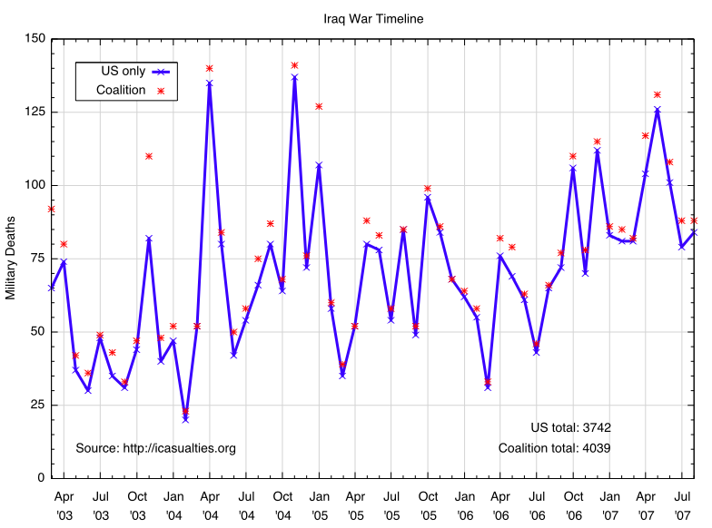
What’s clear from the graph is that US and coalition military fatalities in Iraq since last fall are distinctly higher than in the 18-20 months before then. The rise in fatalities came before the surge and has not been affected by it. Any other interpretation of the figures is bullshit.
Yes, it’s true that helicopter crashes added substantially to the August figure, but I see no reason to discount the figure because:
- “Non-hostile” deaths have always been part of the fatality count. And as far as I know, the troops on the helicopters that crashed were on missions related to the war, so they are fatalities of war.
- The DOD has often attributed helicopter crashes to mechanical failures, only to later reclassify the crashes as the result of hostile fire.
What I have learned from following the data posted to icasualties.org is that the month-to-month variation in fatalities is too great to be able to call 2-3 months of figures a “trend.” And any predictions based on averages, running averages, least-squares fits, etc. are just foolish. In fact, any predictions at all are just foolish. We can only hope that each new month will be better than the last.